Can a small apartment be made to feel larger and more luxurious?
Interior designer Joey Khu elevates the ambience of this modestly-sized home by reducing visual clutter, increasing natural light and spatial flow, and employing a dark, cosy palette.
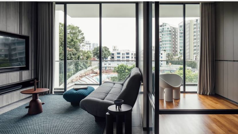
A married couple in their thirties live in this 990 sq ft, two-bedroom apartment in the west of Singapore. (Photo: Studio Periphery)
In many condominiums built in the 70s and 80s in Singapore, there was a true sense of spatial luxury. But today, only the most upscale condominium units offer that kind of generosity. So how can homeowners make the best use of their limited square footage but still have a home that feels exclusive and luxurious?
This apartment by interior designer Joey Khu is one example. A married couple in their thirties live in this 990 sq ft, two-bedroom apartment in the west of Singapore. It is smaller than their former three-bedroom condominium unit.
The couple were willing to downgrade space-wise as they were drawn to the new location’s unique melange of restaurants and markets, as well as its hilly vantage perched on a hill.
“We like that it’s close to nature. We can take hikes to Bukit Timah Hill and walk along the Rail Corridor,” said the wife.
READ> Single buyer purchases all 20 units at Orchard condo for almost S$300 million
They had engaged Khu to design their former home, having seen his projects on social media and magazines. “We really like his style. It is aligned to what we both like, such as dark tones and neutral backdrops,” said the husband.
For this home, they decided to work with him again, giving him carte blanche with the only criteria that he maximises the space and make it feel more open.
The original space was not exactly the most liveable. The private lift doors opened straight into the dining area and master bedroom beyond. The in-ceiling air-conditioner compacted the apartment’s floor-to-ceiling height. And spaces were compartmentalised.
To make the apartment feel larger, Khu introduced a bevy of clever spatial and visual measures grounded by practicality. On the aesthetic front, a streamlined palette, dark colours and refined details give the home a luxe factor akin to that of modern design hotels.
READ> House tour: An apartment in Singapore with the qualities of a landed home
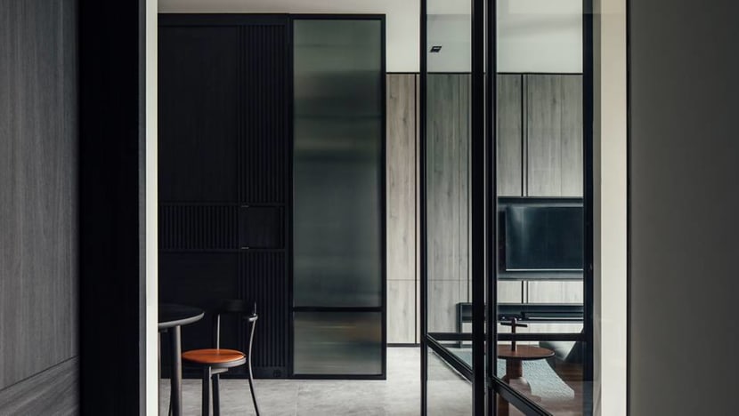
To solve the awkward entry, he encased the private lift lobby with a black metal-and-fluted glass screen and glass sliding door. Guests step into a small foyer illuminated by diffused light. This pause before one enters the house proper gives formality to the entry sequence, as well as privacy for the couple when they take the lift with neighbours. In the screen panels, Khu detailed a small pocket window for deliveries.
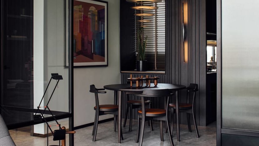
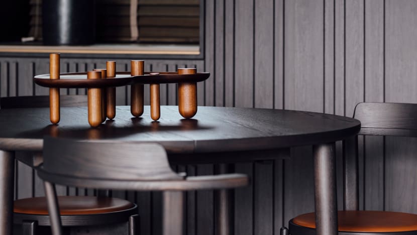
In the dining area, a wall textured with dark timber strips mirrors the black private lift lobby walls. A sleek, silver Apex wall lamp by designer Karim Rashid for Fontana Arte gives a sense of scale, highlights the patterns and doubles up as a wall sculpture.
A coffee corner built up from a small bay window and a large opening into the kitchen created by removing the kitchen door punctures this panel. As the couple only does light cooking, they did not need a segregated cooking area. This gesture segues the living and dining into one continuous zone.
Plenty of storage keeps the home clutter-free and upholds the overall minimal aesthetic. In the master bedroom and master bathroom, Khu also added storage units above the bay windows. In the living room, a full wall of storage around the television tucks the couple’s shoes and paraphernalia out of sight.
In the master bedroom, Khu pushed the door forward to remove a dead corner. This let him insert another block of wardrobes that segregates the changing and sleeping zones, which is useful when one of the owners wakes early to get ready for work while the other is still asleep. As the master bathroom’s door was unnecessarily wide, he made it smaller and built up another column of cabinets in the extra space for the wife as a concealed vanity.
“[The pandemic] gave us time to think about what we liked in the places we stayed in on holidays. We like modern, minimalist hotels and our friends who visit say our home does feel like one.” – The homeowner
WATCH> Inside Sheng Siong co-founder Lim Hock Leng’s 33,700 sq ft family home
ONWARDS AND UPWARDS
If one cannot extend the footprint, another way is to extend upwards.
Khu changed the concealed ceiling air-conditioner system to exposed, wall-mounted units, increasing the ceiling height substantially. This is particularly important in the dining room, as it is the first space guests enter into. A mobile-like Enigma 545 Louis Poulsen pendant from Grafunkt cascading above the dining table accentuates the loftiness.
While many are apprehensive about applying dark tones to a small home, following the common belief that white walls reflect light for a more spacious feel, the dark palette works here to create focal points and blur edges.
“By absorbing the light, the room’s walls are less clearly defined and can give the illusion of more space. The fluid space becomes unstructured and somewhat unexpected,” explained Khu.
He gave the interiors a minimalist and monochromatic palette using a concise mixture of graphite, black and muted greys. Rich materiality and understated textures avoid monotony as they add a sense of visual depth and interest.
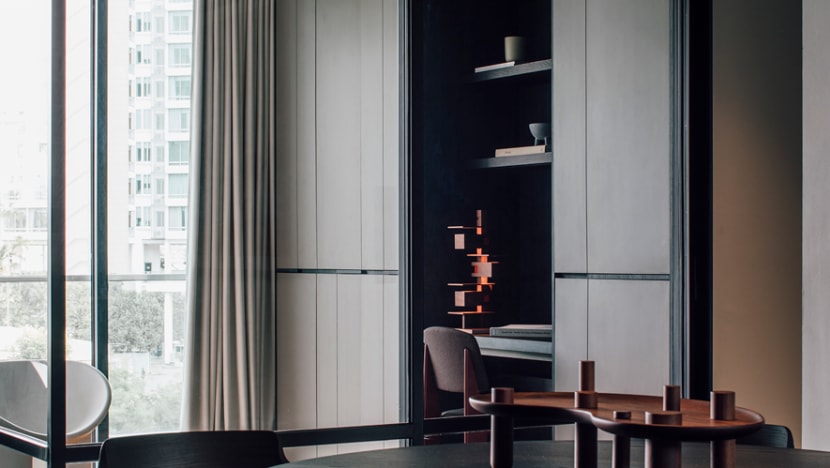
“Subtle details speak volumes,” said the designer on the extensive thought that goes into creating the harmonious interior.
In the common areas, he replaced the glossy, generic beige marble floor tiles with large-format, grey textured tiles. The visual continuity enhances a sense of flow from one area to another. The grey tones also colour the bathroom’s marble walls, bathroom and kitchen countertops and cabinetry around the house.
In the kitchen, the graphite Dekton countertops and backsplash complement the dark-blue Fenix laminate and bronze trimming details in the cabinetry panels. The couple adhered to the scheme with a black refrigerator. It aligns with a black panel covering a magnetic bomb shelter door, decorated with the couple’s travel magnets.
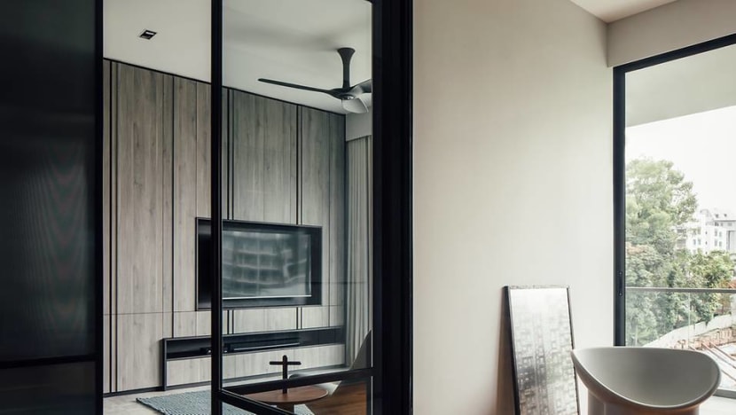
While there are many dark planes, the home feels more cosy than sombre. Khu replaced a part of the front bedroom wall with glass panels and a sliding glass door, which floods the common areas with natural light. It also gives the dining room a view out to the balcony beyond the bedroom.
WATCH> For this family of four, home is a Bali-style oasis in the middle of Singapore
The wife enjoys these vistas from the dining table where she often works on her laptop. “It offers me a sense of calm,” she said. While originally conceived as a guest room, the room is more useful as a study due to current work-from-home arrangements. At the last minute, they tasked Khu to insert a dedicated study area within the wall of wardrobes.
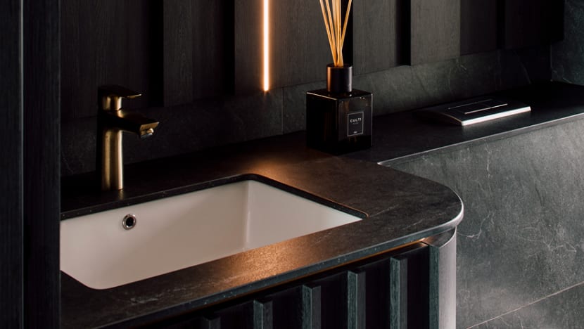
Together with the dark tones, high-gloss accents throughout the home add a sense of sophistication. These are found in the bathroom and kitchen joinery, and elements such as the bronze-finished faucet in the powder room, which Khu did up glamorously in expectation of guest usage.
A stream of light embedded in the powder room wall upturns to the ceiling, adding drama, while views of Bukit Timah Hill in the distance through the large picture window bring green relief. “Some friends say this is the best room in the house,” mused the wife.
The home’s neutral palette is an ideal foil for the pops of colour in the soft furnishing and artworks. “An attention-grabbing artwork can spark conservations and give the space a luxurious feel,” said Khu. The vivid, geometric piece by artist Antoinette Ferwerda backing the dining table illustrates this well. It is the first thing guests see when they enter the home.
Not being able to travel last year increased the couple’s budget, letting them include all these features for the home. Said the wife, “It also gave us time to think about what we liked in the places we stayed in on holidays. We like modern, minimalist hotels and our friends who visit say our home does feel like one.”


