


Find MRT stations confusing? Enhanced signs aim to change that
An enhanced transit signage system was introduced to Thomson-East Coast Line MRT stations. CNA explores why good user experience design matters in our rail network.

See if you can spot the differences in the enhanced transit signage system that's been introduced to stations on the Thomson-East Coast Line. (Photo: CNA/Grace Yeoh)


SINGAPORE: On his way to a company event recently, Mr Zahir Latif got lost – within an MRT station.
The 38-year-old wanted to exit Buona Vista station on the Circle Line to visit The Star Vista mall. Instead, he found himself on an escalator going up from the Circle Line platform to the East-West Line platform, where he had to eventually take a lift down to the ground level and exit the station.
In trying to figure out his way, Mr Zahir, an experience designer, felt “cognitive load”.
In user experience (UX) design, which looks at the experience a user has when they interact with a product, cognitive load refers to the user’s mental strain when they have to think too much to get something done.
“For the most part, good UX design goes unnoticed. People don't realise it because good UX design should be seamless and intuitive. But bad UX design is almost instantly noticeable,” Mr Zahir told CNA.
In MRT stations, the latter would mean “a lot more confused people wondering where to go”, resulting in more bottlenecks, especially at interchange stations with more than two lines.
On the other hand, good UX design enables different users to get to their location in the “easiest, least time-consuming way”, regardless of their "comprehension level” of the station’s signs, he explained.
This too is the ethos surrounding the enhanced design of the transit signage system that was introduced to MRT stations on the Thomson-East Coast Line (TEL), as CNA learnt during a preview of Outram Park station ahead of TEL’s Stage 3 opening on Nov 13.
Outram Park station is now an interchange station for the Thomson-East Coast Line, North-East Line and East-West Line.
Through enhancing colours, contrasts, fonts, icons and signbox sizes, the Land Transport Authority (LTA) showed CNA how the revamp aims to help commuters of all abilities navigate the expanding rail network.
YELLOW FOR EXITS
For a start, all exit-related elements have been presented in yellow for “better continuity and prominence”, noted Ms Goh Mui Mui, senior manager for architecture at LTA.
“A key aspect of a commuter-centred transport system is wayfinding – the stations must be designed to allow commuters to find their way from the street or adjoining developments to the station, and make their way back out again, without stress, anxiety or confusion,” she explained.
As such, Ms Goh’s team believed a “prominent colour” would help.
“The team conducted ground-sensing surveys with the commuters. The survey result showed that yellow is the most popular colour and commuters tend to associate yellow with its salient positive emotions. Yellow also has the best colour contrast with black background,” she said.
The shade of yellow might also bring to mind the logo of Yellow Pages – remembered for its directories of phone numbers printed on yellow paper – and lead one to associate such signs with help and directions.
NUMBERS, NOT LETTERS
Additionally, exits are now labelled in numbers instead of letters of the alphabet for “universal understanding”, Ms Goh pointed out.
“Numerals were chosen to indicate the exits as they can be universally understood in any language or local dialect. This ensures that signage remains relatable for all commuters,” she said.
Using numerals also differentiates the exits from the station platforms, which are indicated with letters of the alphabet.
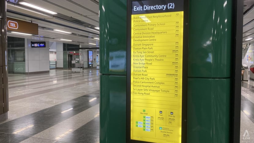
ENHANCED EXIT DIRECTORY
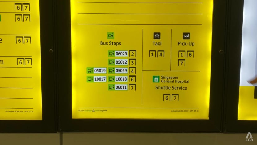
With an "improved and complete list" of surrounding landmarks, the enhanced exit directories display amenities such as bus stops, taxi stands and pick-up points, said Ms Goh.
One useful addition is the five-digit bus stop codes, which can be found within the locality map as well as listed in the exit directories. As these bus codes are used in various transport apps, adding them to the station's maps and directories helps commuters plan their journey easier.
These exit directories are also located within the ticketed areas of Thomson-East Coast Line stations, whereas they are only available outside the gantries at other lines.
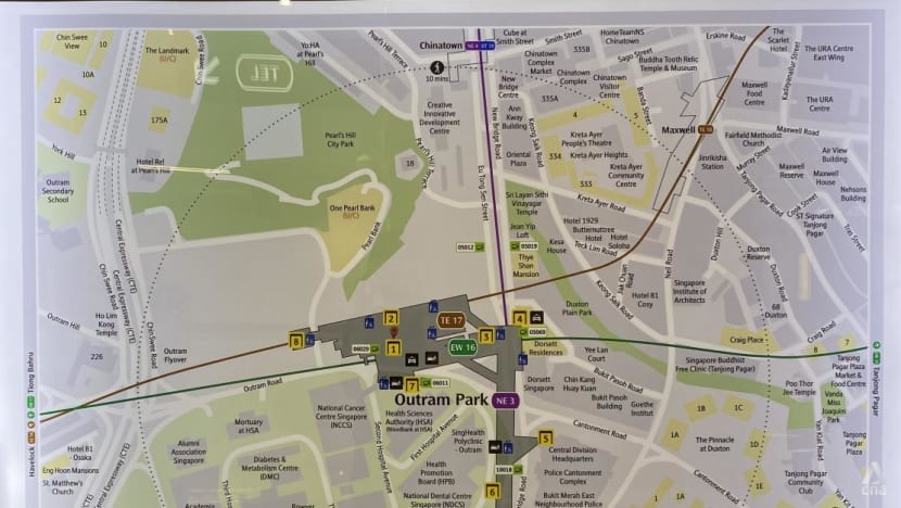
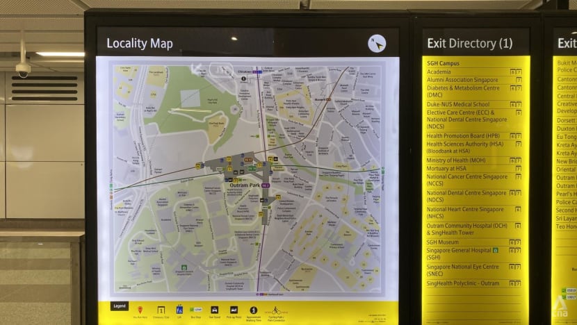
"WALKING RADIUS" ON LOCALITY MAPS
The locality map, which is often placed beside exit directories, now comprise a new "walking radius" introduced to guide journey planning, added Ms Goh.
Landmarks within a 10-minute walking radius of the station are enclosed within a dotted circle, helping commuters better gauge their travel time.
Moreover, each map has been adjusted to align with the viewer's position so they don't have to recalibrate their bearings.
The maps are also located within the ticketed areas of all Thomson-East Coast Line stations.
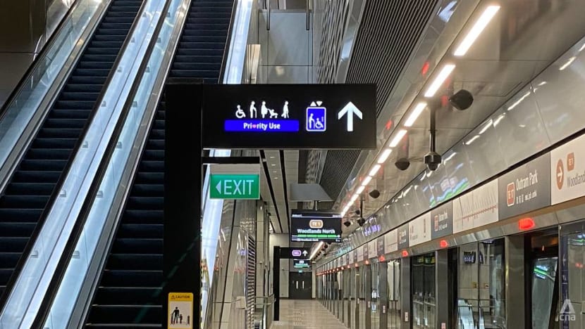
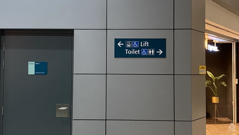
CLEARER DIRECTIONAL SIGNS
Directional signs now have better colour contrast and icon sizes have been increased threefold, said Ms Goh.
"Commuters give feedback that overhead directional signs are too cluttered and difficult to follow. On the other hand, they also requested more landmarks to be added to directional signs."
The team then re-examined the purpose of directional signs and studied how commuters and station operators utilised the signs, consolidating the information in a "one-stop information point" provided at multiple strategic locations that are easy for commuters to locate, added Ms Goh.
"This resulted in a clearer definition of each sign’s role in transit wayfinding, with both the hardware and graphics of directional signs completely redesigned."
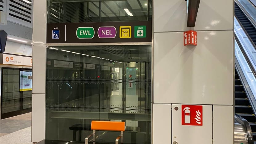
For instance, lift panels feature signs that indicate where commuters can go if they ride the lift.
The new font in the enhanced signage system was also used across all signs identifying the three different MRT lines at Outram Park station.
As an interchange station is seen as one station, and not two or three different stations, its signage system must display continuity so commuters don't have to digest several signage "languages".
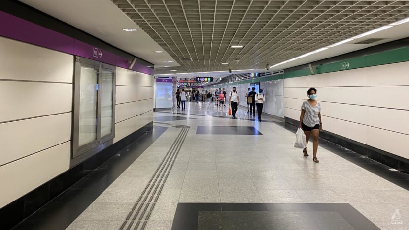
Commuters at Outram Park station may also notice bold coloured strips along the connecting pathways to the MRT lines. The coloured strips act as a continuous guide for commuters to assure them of the direction they are headed.
These strips were not placed on the ground, so they would remain visible in a crowd.
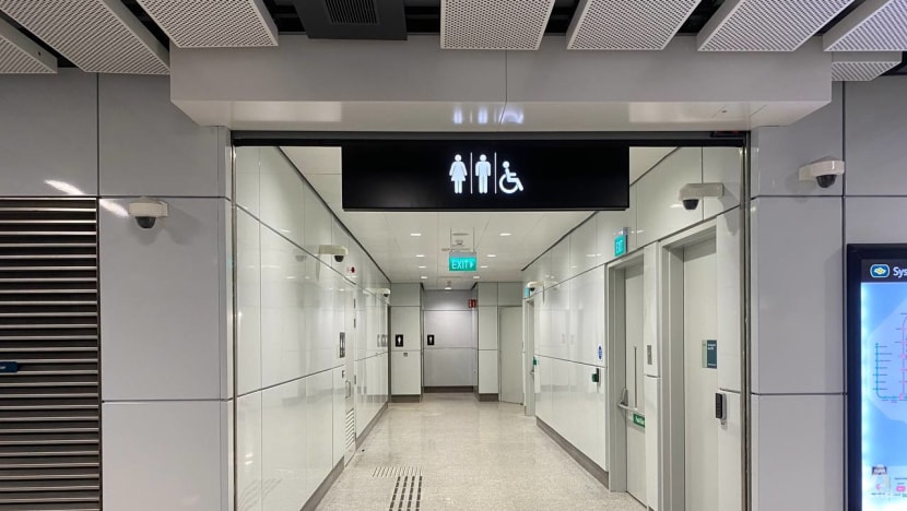
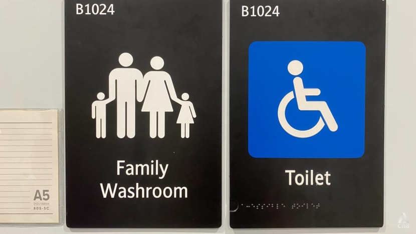
TOILET AND LIFT PICTOGRAMS
Toilet and lift pictograms have been redesigned to “better differentiate the facilities”, as commuters said they often mix up the two signs “due to their size and design”, said Ms Goh.
In older stations, toilet pictograms are similar to lift pictograms, with each represented by standing figures. Even though the toilet pictogram features a male and female standing figure, the average commuter might not be able to tell its difference from the lift pictogram from afar. The latter features three standing figures within a box.
In comparison, the new lift pictogram has a figure holding a walking stick and another figure in a wheelchair within a box. This further points out the lifts for commuters who have a greater need for them.
The pictograms are also represented by different colours in the new signage system. Toilet signs are in black, while lift signs are in blue.
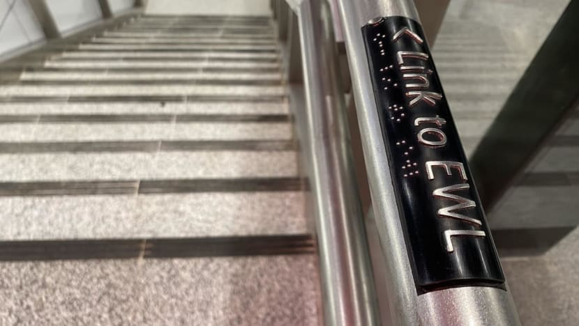
BRAILLE AND TACTILE SIGNS
To make transiting in the MRT system easier for the visually impaired, TEL stations include the “provision of Braille and embossed text on the handrails of public staircases and ramps”, said Ms Goh.
Signs for public toilets are also provided with Braille and embossed text for "easy identification”.
EXTENSIVE RESEARCH AND TESTING
While many might not think twice about the transit signage system that ensures a smooth commute, the journey to refresh the system started in 2015 at LTA, noted Ms Goh.
It included “extensive research and testing” to determine how to enhance the system to become “more intuitive and user-friendly”.
This meant engaging with different commuters, from the elderly to public transport operators, to seek feedback.
LTA also engaged transit wayfinding consulting firm, Transport Design Consultancy, to review certain technical aspects of the signage system. Signs were tested for their readability, legibility and usability, which include colours, contrasts, fonts, icons and signbox sizes.
In 2016, LTA worked with the Nanyang Technological University to “track eye movement and user’s response rate” through laboratory tests to “understand how users respond to and process the information provided on signages”, added Ms Goh.
Further evaluation was then conducted, such as by placing proposed signage designs onto images of existing station environments and testing prototypes of different signs with commuters within a station.
The final proof of concept was conducted at Fort Canning station prior to Stage 3 of the Downtown Line opening, which allowed the team to “gather greater insights on design proposals”.
These lessons were eventually published in a new transit signage manual by LTA’s signage team.
The team ultimately needed to be able to "wear different hats as a commuter and a designer to be able to see and address issues from different perspectives”, added Ms Goh.
“Good UX design targets to understand the problems users face and design solutions that are universal, inclusive and accessible to all.”
After all, most commuters probably share the same goal as Mr Zahir who experienced less-than-ideal UX design on his commute.
“To just keep (their) legs moving, go through the right stations, walk through the right exits” and get to work "on autopilot", he said.